In mathematics, a combination is a selection of items from a collection, such that (unlike permutations) the order of selection does not matter. For example, given three fruits, say an apple, an orange and a pear, there are three combinations of two that can be drawn from this set: an apple and a pear; an apple and an orange; or a pear and an orange.
More formally, a k-combination of a set S is a subset of k distinct elements of S. If the set has n elements, the number of k-combinations is equal to the binomial coefficient
which can be written using factorials as whenever , and which is zero when k > 0. The set of all k-combinations of a set S is often denoted by .
Combinations refer to the combination of n things taken k at a time without repetition. To refer to combinations in which repetition is allowed, the terms k-selection, k-multiset, or k-combination with repetition are often used. If, in the above example, it were possible to have two of any one kind of fruit there would be 3 more 2-selections: one with two apples, one with two oranges, and one with two pears.
Although the set of three fruits was small enough to write a complete list of combinations, with large sets this becomes impractical. For example, a poker hand can be described as a 5-combination (k = 5) of cards from a 52 card deck (n = 52). The 5 cards of the hand are all distinct, and the order of cards in the hand does not matter. There are 2,598,960 such combinations, and the chance of drawing any one hand at random is 1 / 2,598,960.
Video: Combinations vs. Permutations
Number of k-combinations
3-element subsets of a 5-element set
The number of k-combinations from a given set S of n elements is often denoted in elementary combinatorics texts by , or by a variation such as , , , or even (the latter form was standard in French, Romanian, Russian, Chineseand Polish texts. The same number however occurs in many other mathematical contexts, where it is denoted by (often read as "n choose k"); notably it occurs as a coefficient in the binomial formula, hence its name binomial coefficient. One can define for all natural numbers k at once by the relation
from which it is clear that
and further,
for k > n.
Video: Sum of binomial coefficients
To see that these coefficients count k-combinations from S, one can first consider a collection of n distinct variables Xs labeled by the elements s of S, and expand the product over all elements of S:
it has 2n distinct terms corresponding to all the subsets of S, each subset giving the product of the corresponding variables Xs. Now setting all of the Xs equal to the unlabeled variable X, so that the product becomes (1 + X)n, the term for each k-combination from S becomes Xk, so that the coefficient of that power in the result equals the number of such k-combinations.
Binomial coefficients can be computed explicitly in various ways. To get all of them for the expansions up to (1 + X)n, one can use (in addition to the basic cases already given) the recursion relation
for 0 < k < n, which follows from (1 + X)n = (1 + X)n − 1(1 + X); this leads to the construction of Pascal's triangle.
For determining an individual binomial coefficient, it is more practical to use the formula
.
The numerator gives the number of k-permutations of n, i.e., of sequences of k distinct elements of S, while the denominator gives the number of such k-permutations that give the same k-combination when the order is ignored.
When k exceeds n/2, the above formula contains factors common to the numerator and the denominator, and canceling them out gives the relation
for 0 ≤ k ≤ n. This expresses a symmetry that is evident from the binomial formula, and can also be understood in terms of k-combinations by taking the complement of such a combination, which is an (n − k)-combination.
Finally there is a formula which exhibits this symmetry directly, and has the merit of being easy to remember:
where n! denotes the factorial of n. It is obtained from the previous formula by multiplying denominator and numerator by (n − k)!, so it is certainly inferior as a method of computation to that formula.
The last formula can be understood directly, by considering the n! permutations of all the elements of S. Each such permutation gives a k-combination by selecting its first k elements. There are many duplicate selections: any combined permutation of the first k elements among each other, and of the final (n − k) elements among each other produces the same combination; this explains the division in the formula.
Example of counting combinations
Video: Combinations Counting Example
As a specific example, one can compute the number of five-card hands possible from a standard fifty-two card deck as:
Alternatively one may use the formula in terms of factorials and cancel the factors in the numerator against parts of the factors in the denominator, after which only multiplication of the remaining
Another alternative computation, equivalent to the first, is based on writing
which gives
.
When evaluated in the following order, 52 ÷ 1 × 51 ÷ 2 × 50 ÷ 3 × 49 ÷ 4 × 48 ÷ 5, this can be computed using only integer arithmetic. The reason is that when each division occurs, the intermediate result that is produced is itself a binomial coefficient, so no remainders ever occur.
Using the symmetric formula in terms of factorials without performing simplifications gives a rather extensive calculation:
Enumerating k-combinations
One can enumerate all k-combinations of a given set S of n elements in some fixed order, which establishes a bijection from an interval of integers with the set of those k-combinations. Assuming S is itself ordered, for instance S = { 1, 2, …, n }, there are two natural possibilities for ordering its k-combinations: by comparing their smallest elements first (as in the illustrations above) or by comparing their largest elements first. The latter option has the advantage that adding a new largest element to S will not change the initial part of the enumeration, but just add the new k-combinations of the larger set after the previous ones. Repeating this process, the enumeration can be extended indefinitely with k-combinations of ever larger sets. If moreover the intervals of the integers are taken to start at 0, then the k-combination at a given place i in the enumeration can be computed easily from i, and the bijection so obtained is known as the combinatorial number system. It is also known as "rank"/"ranking" and "unranking" in computational mathematics.[6][7]
There are many ways to enumerate k combinations. One way is to visit all the binary numbers less than 2n. Choose those numbers having k nonzero bits, although this is very inefficient even for small n (e.g. n = 20 would require visiting about one million numbers while the maximum number of allowed k combinations is about 186 thousand for k = 10). The positions of these 1 bits in such a number is a specific k-combination of the set { 1, …, n }.[8] Another simple, faster way is to track k index numbers of the elements selected, starting with {0 .. k−1} (zero-based) or {1 .. k} (one-based) as the first allowed k-combination and then repeatedly moving to the next allowed k-combination by incrementing the last index number if it is lower than n-1 (zero-based) or n (one-based) or the last index number x that is less than the index number following it minus one if such an index exists and resetting the index numbers after x to {x+1, x+2, …}.
Number of combinations with repetition
Video: Permutations and Combinations Problems - 3 Digit Even Number (Repetition Allowed)
A k-combination with repetitions, or k-multicombination, or multisubset of size k from a set S is given by a sequence of k not necessarily distinct elements of S, where order is not taken into account: two sequences define the same multiset if one can be obtained from the other by permuting the terms. In other words, the number of ways to sample k elements from a set of n elements allowing for duplicates (i.e., with replacement) but disregarding different orderings (e.g. {2,1,2} = {1,2,2}). Associate an index to each element of S and think of the elements of S as types of objects, then we can let denote the number of elements of type i in a multisubset. The number of multisubsets of size k is then the number of nonnegative integer solutions of the Diophantine equation:[9]
If S has n elements, the number of such k-multisubsets is denoted by,
a notation that is analogous to the binomial coefficient which counts k-subsets. This expression, n multichoose k,can also be given in terms of binomial coefficients:
This relationship can be easily proved using a representation known as stars and bars.
A solution of the above Diophantine equation can be represented by stars, a separator (a bar), then more stars, another separator, and so on. The total number of stars in this representation is k and the number of bars is n - 1 (since no separator is needed at the very end). Thus, a string of k + n - 1 symbols (stars and bars) corresponds to a solution if there are k stars in the string. Any solution can be represented by choosing k out of k + n - 1 positions to place stars and filling the remaining positions with bars. For example, the solution of the equation can be represented by
The number of such strings is the number of ways to place 10 stars in 13 positions, which is the number of 10-multisubsets of a set with 4 elements.
Bijection between 3-subsets of a 7-set (left) and 3-multisets with elements from a 5-set (right). This illustrates that .
As with binomial coefficients, there are several relationships between these multichoose expressions. For example, for ,
This identity follows from interchanging the stars and bars in the above representation.
Example of counting multisubsets
For example, if you have four types of donuts (n = 4) on a menu to choose from and you want three donuts (k = 3), the number of ways to choose the donuts with repetition can be calculated as
This result can be verified by listing all the 3-multisubsets of the set S = {1,2,3,4}. This is displayed in the following table. The second column shows the nonnegative integer solutions of the equation and the last column gives the stars and bars representation of the solutions.
Hello Science Genie. Let's now learn about the scatter plot. A scatter plot is a type of plot or mathematical diagram using Cartesian coordinates and is used to display values for typically two variables for a set of data. If the points are color-coded, one additional variable can be displayed in the scatter plot. The data are displayed as a collection of points. Each point has the value of one variable determining the position on the horizontal axis and the value of the other variable determining the position on the vertical axis.
What are the other names for a scatter plot?
A scatter plot is also called a scatterplot, scatter graph, scatter chart, scattergram, or scatter diagram.
Video: Constructing a scatter plot | Regression
Scatter plot
First described by
John Herschel
Purpose
To identify the type of relationship (if any) between two quantitative variables
Let us look at a Scatter Plot example
For example, to display a link between a person's lung capacity, and how long that person could hold his/her breath, a researcher would choose a group of people to study, then measure each one's lung capacity (first variable) and how long that person could hold his/her breath (second variable). The researcher would then plot the data in a scatter plot, assigning "lung capacity" to the horizontal axis, and "time holding breath" to the vertical axis.
A person with a lung capacity of 400 cl who held his/her breath for 21.7 seconds would be represented by a single dot on the scatter plot at the point (400, 21.7) in the Cartesian coordinates. The scatter plot of all the people in the study would enable the researcher to obtain a visual comparison of the two variables in the data set, and will help to determine what kind of relationship there might be between the two variables.
Video: Studying, shoe size, and test scores scatter plots
Overview
What are dependent and independent variables?
A scatter plot can be used either when one continuous variable is under the control of the experimenter and the other depends on it or when both continuous variables are independent. If a parameter exists that is systematically incremented and/or decremented by the other, it is called the control parameteror independent variable and is customarily plotted along the horizontal axis. The measured or dependent variable is customarily plotted along the vertical axis. If no dependent variable exists, either type of variable can be plotted on either axis and a scatter plot will illustrate only the degree of correlation (not causation) between two variables.
Video: Scatterplots and Correlations
What is a Correlation?
A scatter plot can suggest various kinds of correlations between variables with a certain confidence interval. For example, weight and height, weight would be on y axis and height would be on the x axis. Correlations may be positive (rising), negative (falling), or null (uncorrelated).
How to identify a positive correlation?
If the pattern of dots slopes from lower left to upper right, it indicates a positive ................
...............
NOTE: You need to be subscribed to either a monthly or annual plan to view the full set of Math Lessons (Study Guide)
Please visit to register for a plan.
Let's Review
A ___________ is a type of plot or mathematical diagram using Cartesian coordinates and is used to display values for typically two variables for a set of data.
A scatter plot is also called a ___________ , ___________ , ___________ , ___________ or ___________
The measured or dependent variable is customarily plotted along the ___________ axis.
___________ may be positive (rising), negative (falling), or null (uncorrelated).
If the pattern of dots slopes from lower left to upper right, it indicates a ___________ correlation between the variables being studied.
A line of best fit (alternatively called '___________ ') can be drawn in order to study the relationship between the variables.
For a linear correlation, the best-fit procedure is known as ___________ ___________ and is guaranteed to generate a correct solution in a finite time.
Scatter diagram is one of the seven basic tools of ___________ ___________.
Scatter charts can be built in the form of ___________, ___________, or/and ___________.
Answer
A scatter plotis a type of plot or mathematical diagram using Cartesian coordinates and is used to display values for typically two variables for a set of data.
A scatter plot is also called a scatterplot, scatter graph, scatter chart, scattergram, or scatter diagram.
The measured or dependent variable is customarily plotted along the vertical axis.
Correlations may be positive (rising), negative (falling), or null (uncorrelated).
If the pattern of dots slopes from lower left to upper right, it indicates a positive correlation between the variables being studied.
A line of best fit (alternatively called 'trendline') can be drawn in order to study the relationship between the variables.
For a linear correlation, the best-fit procedure is known as linear regression and is guaranteed to generate a correct solution in a finite time.
Scatter diagram is one of the seven basic tools of quality control.
Scatter charts can be built in the form of bubble, marker, or/and line charts.
The mode of a set of data values is the value that appears most often. It is the value x at which its probability mass function takes its maximum value. In other words, it is the value that is most likely to be sampled.
Video: How to find the mode of a set of numbers.
Like the statistical mean and median, the mode is a way of expressing, in a (usually) single number, important information about a random variable or a population. The numerical value of the mode is the same as that of the mean and median in a normal distribution, and it may be very different in highly skewed distributions.
Mode of a sample
The mode of a sample is the element that occurs most often in the collection. For example, the mode of the sample [1, 3, 6, 6, 6, 6, 7, 7, 12, 12, 17] is 6. Given the list of data [1, 1, 2, 4, 4] the mode is not unique – the dataset may be said to be bimodal, while a set with more than two modes may be described as multimodal.
Comparison of mean, median and mode
Geometric visualisation of the mode, median and mean of an arbitrary probability density function.
Video: What are Mean, Median and Mode?
Comparison of common averages of values { 1, 2, 2, 3, 4, 7, 9 }
Type
Description
Example
Result
Arithmetic mean
Sum of values of a data set divided by number of values:
A histogram is an accurate representation of the distribution of numerical data. It is an estimate of the probability distribution of a continuous variable (quantitative variable) and was first introduced by Karl Pearson.
How does a histogram differ from a bar graph?
Histogram differs from a bar graph, in the sense that a bar graph relates two variables, but a histogram relates only one. Histograms are sometimes confused with bar charts. A histogram is used for continuous data, whereas the bins represent ranges of data, while a bar chart is a plot of categorical variables. Some authors recommend that bar charts have gaps between the rectangles to clarify the distinction.
Video: How a histogram is different than a bar chart?
How do you construct a histogram?
To construct a histogram, the first step is to "bin" (or "bucket") the range of values—that is, divide the entire range of values into a series of intervals—and then count how many values fall into each interval. The bins are usually specified as consecutive, non-overlapping intervals of a variable. The bins (intervals) must be adjacent, and are often (but are not required to be) of equal size.
Video: Statistics - How to make a histogram
Is a histogram used in quality control?
Yes, the histogram is one of the seven basic tools of quality control.
Video: When to Use Histograms
Example of a histogram
This is the data for the histogram to the right, using 500 items:
Bin
Count
−3.5 to -2.51
9
−2.5 to -1.51
32
−1.5 to -0.51
109
−0.5 to 0.49
180
0.5 to 1.49
132
1.5 to 2.49
34
2.5 to 3.49
4
Video: Statistics - Reading the shape of a distribution
What are the different patterns one can see in a histogram?
The words used to describe the patterns in a histogram are: "symmetric", "skewed left" or "right", "unimodal", "bimodal" or "multimodal".
Symmetric, unimodal
Skewed right
Skewed left
...........
NOTE: You need to be subscribed to either a monthly or annual plan to view the full set of Math Lessons (Study Guide)
Please visit to register for a plan.
Let's Review
A _________ is an accurate representation of the distribution of numerical data.
A histogram is an estimate of the _________ distribution of a continuous variable (quantitative variable)
Histogram differs from a bar graph, in the sense that a bar graph relates _________ variables, but a histogram relates only _________.
A histogram is used for _________ data, whereas the bins represent _________ of data, while a bar chart is a plot of categorical variables.
Histogram is one of the seven basic tools of _________ _________.
The different patterns that can be seen in a histogram are "_________", "_________ _________ _________ " or "_________", "_________", "_________" or "_________".
Histograms give a rough sense of the _________ of the underlying distribution of the data.
Answer
A histogramis an accurate representation of the distribution of numerical data.
A histogram is an estimate of the probability distribution of a continuous variable (quantitative variable)
Histogram differs from a bar graph, in the sense that a bar graph relates two variables, but a histogram relates only one.
A histogram is used for continuous data, whereas the bins represent ranges of data, while a bar chart is a plot of categorical variables.
Histogram is one of the seven basic tools of qualitycontrol.
The different patterns that can be seen in a histogram are "symmetric", "skewed left" or "right", "unimodal", "bimodal" or "multimodal".
Histograms give a rough sense of the density of the underlying distribution of the data.
A line chart or line graph is a type of chart which displays information as a series of data points called 'markers' connected by straight line segments. It is a basic type of chart common in many fields.
How is a line chart different from a scatter plot?
A line chart is similar to a scatter plot except that the measurement points are ordered (typically by their x-axis value) and joined with straight line segments.
What is line chart is used for?
A line chart is often used to visualize a trend in data over intervals of time – a time series – thus the line is often drawn chronologically. In these cases they are known as run charts.
Video: Learning about Line Graphs
Example of a Line Chart
In the experimental sciences, data collected from experiments are often visualized by a graph. For example, ................
NOTE: You need to be subscribed to either a monthly or annual plan to view the full set of Math Lessons (Study Guide)
Please visit to register for a plan.
Let's Review
A ________ ________ or ________ ________ is a type of chart which displays information as a series of data points called '________ ' connected by straight line segments.
A line chart is similar to a scatter plot except that the measurement points are ordered (typically by their x-axis value) and joined with ______ ______ segments.
A line chart is often used to visualize a ___________ in data over intervals of time – a time series – thus the line is often drawn chronologically.
When line charts are drawn as a time series, they are also known as ___________ charts.
Answer
A linechart or linegraph is a type of chart which displays information as a series of data points called 'markers' connected by straight line segments.
A line chart is similar to a scatter plot except that the measurement points are ordered (typically by their x-axis value) and joined with straightline segments.
A line chart is often used to visualize a trend in data over intervals of time – a time series – thus the line is often drawn chronologically.
When line charts are drawn as a time series, they are also known as run charts.
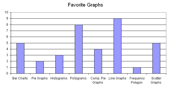
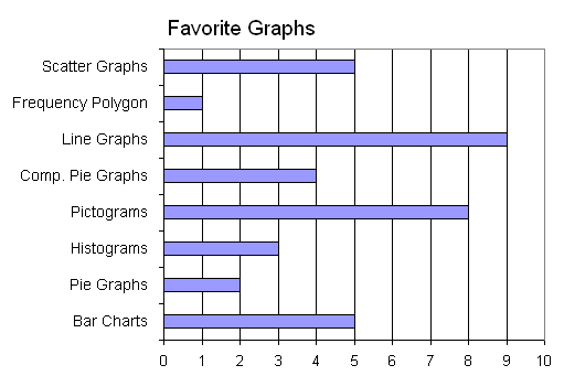
A bar chart or bar graph is a chart or graph that presents categorical data with rectangular bars with heights or lengths proportional to the values that they represent. The bars can be plotted vertically or horizontally. A vertical bar chart is sometimes called a line graph.
Veritcal Bar Chart (also known as Line Graph)
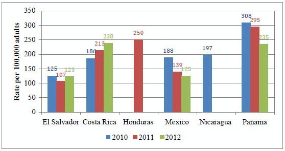
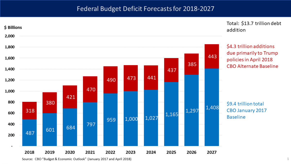
A bar graph shows comparisons among discrete categories. One axis of the chart shows the specific categories being compared, and the other axis represents a measured value. Some bar graphs present bars clustered in groups of more than one, showing the values of more than one measured variable.
Bar charts have a discrete domain of categories, and are usually scaled so that all the data can fit on the chart. When there is no natural ordering of the categories being compared, bars on the chart may be arranged in any order.
How to read a bar chart?
How to Make a Bar Graph in Excel?
What are the different types of bar charts?
The different types of bar charts are horizontal, vertical, grouped, or stacked bar charts.
Horizontal Bar Charts
Grouped Bar Chart
Stacked Bar Chart
What are Pareto ........
.......
NOTE: You need to be subscribed to either a monthly or annual plan to view the full set of Math Lessons (Study Guide)
Please visit to register for a plan.
Let's Review
A ___ ___ or ___ ___ is a chart or graph that presents categorical data with rectangular bars with heights or lengths proportional to the values that they represent.
A vertical bar chart is sometimes called a ___ ___ .
A bar graph shows comparisons among discrete ___.
One axis of the chart shows the specific ___ being compared, and the other axis represents a measured ___ .
The different types of bar charts are ___ , ___ , ___ , or ___ bar charts.
Bar charts arranged from highest to lowest incidence are called ___ charts.
In a column bar chart, the ___ appear along the horizontal axis; the height of the bar corresponds to the ___ of each category.
Bar graphs can also be used for more complex comparisons of data with ___ bar charts and ___ bar charts.
In a ___ bar chart, for each categorical group there are two or more bars.
The ___ bar chart stacks bars that represent different groups on top of each other. The ___ of the resulting bar shows the combined result of the groups.
Stacked bar charts are not suited to datasets where some groups have negative values. In such cases, ___ bar chart are preferable.
Answer
A barchartor bar graph is a chart or graph that presents categorical data with rectangular bars with heights or lengths proportional to the values that they represent.
A vertical bar chart is sometimes called a linegraph.
A bar graph shows comparisons among discrete categories.
One axis of the chart shows the specific categoriesbeing compared, and the other axis represents a measured value.
The different types of bar charts are horizontal,vertical,grouped, or stacked bar charts.
Bar charts arranged from highest to lowest incidence are called Paretocharts.
In a column bar chart, the categoriesappear along the horizontal axis; the height of the bar corresponds to the valueof each category.
Bar graphs can also be used for more complex comparisons of data with groupedbar charts and stackedbar charts.
In a groupedbar chart, for each categorical group there are two or more bars.
The stackedbar chart stacks bars that represent different groups on top of each other. The heightof the resulting bar shows the combined result of the groups.
Stacked bar charts are not suited to datasets where some groups have negative values. In such cases, groupedbar chart are preferable.

 whenever
  , and which is zero when k > 0. The set of all k-combinations of a set S is often denoted by
  .
.
 , or by a variation such as
  ,
,  ,
,  ,
,  or even
  (the latter form was standard in French, Romanian, Russian, Chinese
 (often read as "n choose k"); notably it occurs as a coefficient in the binomial formula, hence its name binomial coefficient. One can define

 for k > n.

 .
.


![{\displaystyle {\begin{alignedat}{2}{52 \choose 5}&={\frac {52!}{5!47!}}\\[5pt]&={\frac {52\times 51\times 50\times 49\times 48\times {\cancel {47!}}}{5\times 4\times 3\times 2\times {\cancel {1}}\times {\cancel {47!}}}}\\[5pt]&={\frac {52\times 51\times 50\times 49\times 48}{5\times 4\times 3\times 2}}\\[5pt]&={\frac {(26\times {\cancel {2}})\times (17\times {\cancel {3}})\times (10\times {\cancel {5}})\times 49\times (12\times {\cancel {4}})}{{\cancel {5}}\times {\cancel {4}}\times {\cancel {3}}\times {\cancel {2}}}}\\[5pt]&={26\times 17\times 10\times 49\times 12}\\[5pt]&=2{,}598{,}960.\end{alignedat}}}](https://wikimedia.org/api/rest_v1/media/math/render/svg/5541f14cc4ca51756ec76a67071c816f69070dfa)

 .
.![{\displaystyle {\begin{aligned}{52 \choose 5}&={\frac {n!}{k!(n-k)!}}={\frac {52!}{5!(52-5)!}}={\frac {52!}{5!47!}}\\[6pt]&={\tfrac {80,658,175,170,943,878,571,660,636,856,403,766,975,289,505,440,883,277,824,000,000,000,000}{120\times 258,623,241,511,168,180,642,964,355,153,611,979,969,197,632,389,120,000,000,000}}\\[6pt]&=2{,}598{,}960.\end{aligned}}}](https://wikimedia.org/api/rest_v1/media/math/render/svg/71b6bc44a40b770f570cabbf47c9476b54bb1d56)
 denote the number of elements of type i in a multisubset. The number of multisubsets of size k is then the number of nonnegative integer solutions of the Diophantine equation:[9]


 stars, a separator (a bar), then
  more stars, another separator, and so on. The total number of stars in this representation is k and the number of bars is n - 1 (since no separator is needed at the very end). Thus, a string of k + n - 1 symbols (stars and bars) corresponds to a solution if there are k stars in the string. Any solution can be represented by choosing k out of k + n - 1 positions to place stars and filling the remaining positions with bars. For example, the solution
  of the equation
  can be represented by
 which is the number of 10-multisubsets of a set with 4 elements.
 .
. ,
,

![[x_{1},x_{2},x_{3},x_{4}]](https://wikimedia.org/api/rest_v1/media/math/render/svg/cbec11b6cf47c5e117f30ff33ecc05c54e84e9ec) of the equation
of the equation  and the last column gives the stars and bars representation of the solutions.