A bar chart or bar graph is a chart or graph that presents categorical data with rectangular bars with heights or lengths proportional to the values that they represent. The bars can be plotted vertically or horizontally. A vertical bar chart is sometimes called a line graph.
Veritcal Bar Chart (also known as Line Graph)
A bar graph shows comparisons among discrete categories. One axis of the chart shows the specific categories being compared, and the other axis represents a measured value. Some bar graphs present bars clustered in groups of more than one, showing the values of more than one measured variable.
Bar charts have a discrete domain of categories, and are usually scaled so that all the data can fit on the chart. When there is no natural ordering of the categories being compared, bars on the chart may be arranged in any order.
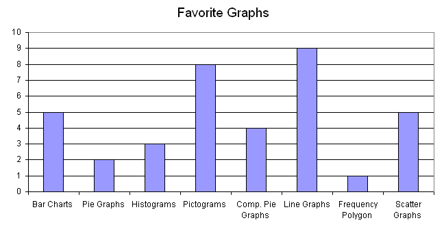
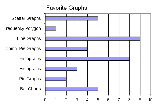
How to read a bar chart?
How to Make a Bar Graph in Excel?
What are the different types of bar charts?
The different types of bar charts are horizontal, vertical, grouped, or stacked bar charts.
Horizontal Bar Charts
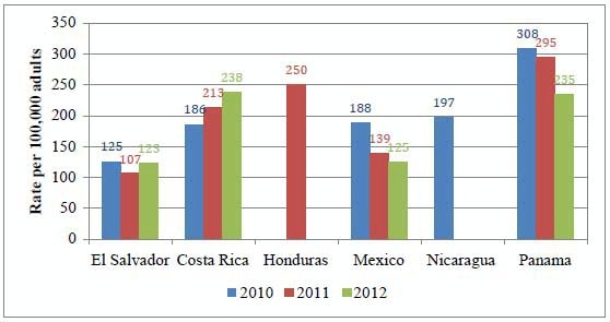
Grouped Bar Chart
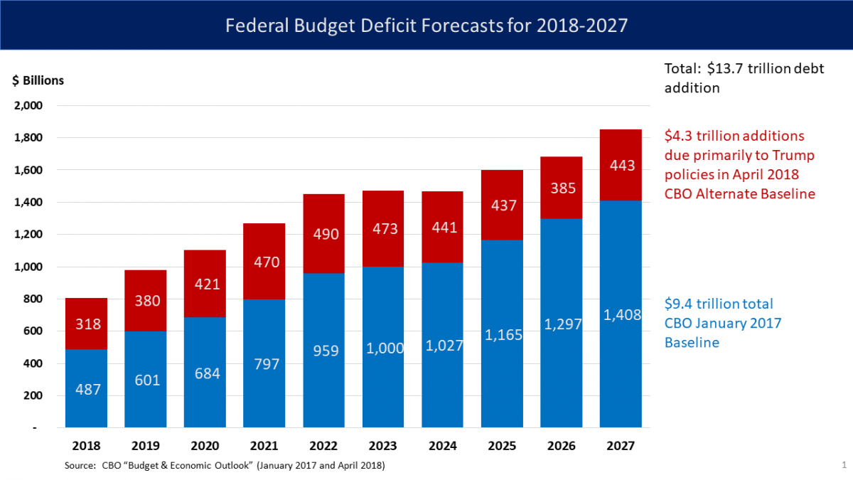
Stacked Bar Chart
What are Pareto ........
.......
NOTE: You need to be subscribed to either a monthly or annual plan to view the full set of Math Lessons (Study Guide)
Please visit to register for a plan.
Let's Review
A ___ ___ or ___ ___ is a chart or graph that presents categorical data with rectangular bars with heights or lengths proportional to the values that they represent.
A vertical bar chart is sometimes called a ___ ___ .
A bar graph shows comparisons among discrete ___.
One axis of the chart shows the specific ___ being compared, and the other axis represents a measured ___ .
The different types of bar charts are ___ , ___ , ___ , or ___ bar charts.
Bar charts arranged from highest to lowest incidence are called ___ charts.
In a column bar chart, the ___ appear along the horizontal axis; the height of the bar corresponds to the ___ of each category.
Bar graphs can also be used for more complex comparisons of data with ___ bar charts and ___ bar charts.
In a ___ bar chart, for each categorical group there are two or more bars.
The ___ bar chart stacks bars that represent different groups on top of each other. The ___ of the resulting bar shows the combined result of the groups.
Stacked bar charts are not suited to datasets where some groups have negative values. In such cases, ___ bar chart are preferable.
Answer
A barchartor bar graph is a chart or graph that presents categorical data with rectangular bars with heights or lengths proportional to the values that they represent.
A vertical bar chart is sometimes called a linegraph.
A bar graph shows comparisons among discrete categories.
One axis of the chart shows the specific categoriesbeing compared, and the other axis represents a measured value.
The different types of bar charts are horizontal,vertical,grouped, or stacked bar charts.
Bar charts arranged from highest to lowest incidence are called Paretocharts.
In a column bar chart, the categoriesappear along the horizontal axis; the height of the bar corresponds to the valueof each category.
Bar graphs can also be used for more complex comparisons of data with groupedbar charts and stackedbar charts.
In a groupedbar chart, for each categorical group there are two or more bars.
The stackedbar chart stacks bars that represent different groups on top of each other. The heightof the resulting bar shows the combined result of the groups.
Stacked bar charts are not suited to datasets where some groups have negative values. In such cases, groupedbar chart are preferable.